Striking a Balance: Power BI Design & Maintainability
Creating a Power BI report that is both visually appealing and easy to maintain is an art form that requires careful consideration. We’ll delve into the best practices for achieving this balance, ensuring your reports are not only impactful but also sustainable in the long run.
I. The Importance of Good Design
A well-designed Power BI report captures the audience’s attention and communicates insights effectively. Keep in mind the following design principles:
- Clarity and Simplicity: Avoid cluttering your reports with unnecessary elements. Allow ample space between your visuals, strategically place key metrics that matter most to your audience, and group charts that are related to one another.
- Consistent Styling: Consistency in fonts, colors, and chart types enhances readability. Establish a style guide for you and your team to maintain uniformity across different dashboards.
II. Ensuring Maintainability
While good design is crucial, maintainability ensures that your reports remain functional and relevant over time. Here are some tips to keep your reports manageable:
- Modular Design: Break down complex reports into smaller, manageable components. Create and use a Power BI report template as a base to create reusable elements that can be easily updated and utilized by the whole team/department.
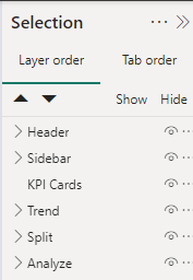
- Documentation: Document your data sources, add comments on your complex measures, and group your visual elements (View>Selection Pane). This makes it easier for others (and your future self) to understand and maintain the report.
- Performance Optimization: Ensure your reports load quickly by optimizing data models and reducing the complexity of calculations. Use Power BI’s performance analyzer tool to identify and address bottlenecks.
IV. Achieving the Balance
Balancing good design with maintainability requires a thoughtful approach:
- Start with the End in Mind: Understand the needs of your audience and the key insights they require. Design your reports with the end goals in focus. Wireframe/mockup is a must!
- Less is more: The goal is insight, not just information. Highlight the insights by reducing noise (unnecessary visual elements). Plus, leaner reports load faster and are easy to digest.
- Native before Custom: Before resorting to using custom visuals, see if something can be done using native/core visuals. Chances are you can achieve a similar visual representation using Power BI native/core visuals.
- Leverage Power BI Features: Create and utilize themes and report templates when co-authoring reports. Also, some of the latest updates on Power BI open up a lot of flexibility in terms of designing Power BI reports. Here are some features you can explore and integrate in your design:
- Page Navigator
- Slicer (new Power BI Core Visuals)
- Card with Reference Labels (new Power BI Core Visuals)
- Field Parameters
- Visual Calculation
- Dynamic Format Strings
We’ll update this list as new features and guides get published.
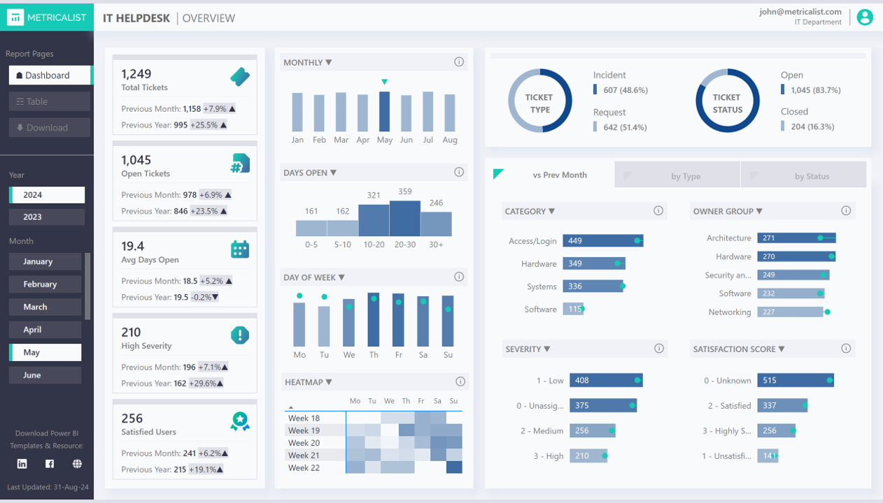
Have a look at this live Power BI demo and see these design practices in action: